This website uses cookies so that we can provide you with the best user experience possible. Cookie information is stored in your browser and performs functions such as recognising you when you return to our website and helping our team to understand which sections of the website you find most interesting and useful.
Business News Digital
Pandora has a rebrand
By Chris Cooke | Published on Thursday 13 October 2016

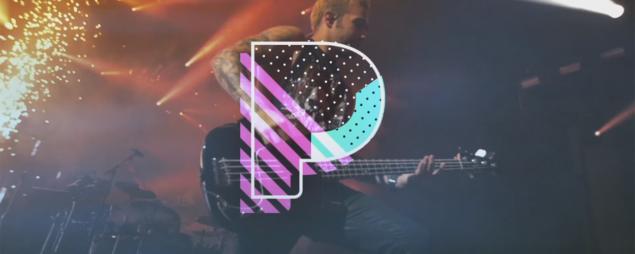
With its existing premium service now revamped as Pandora Plus – and with that fully on-demand option in the pipeline – streaming music firm Pandora has had a bloody rebrand.
What a dynamic range of sound and colour the all new look Pandora logo embraces, visualising – as it does – not just all the energy that artists pour into their tepid love songs, but all that raw emotion too. Please, never forget the emotion of music will you?
And if you ever find yourself designing a logo for a streaming music service, it is absolutely vital you pour as much emotion into your design as possible, while you work out what combination of form, colour and pattern to implement into your unique, diverse portal of branding goodness.
But hey, look at me, getting all carried away about the new Pandora logo. Let’s hear what the service itself has to say about it all shall we? “Music is a personal experience for everyone”, notes the firm in a blog post, “from the artists creating it all the way to the fans listening to it”. Yep, all the way, every single step.
What else? “As Pandora continues to evolve the most personal music experience, our new look embraces the dynamic range of sound and colour, visualising the energy and emotion that artists pour into the creation of music, and that we feel as listeners. Our dynamic brand is composed of form, colour and pattern, which we implemented into the new P icon and serves as your portal into the unique and diverse range of music you love”.
So yeah, Pandora has a new logo. Good times. Here’s a video:


