This website uses cookies so that we can provide you with the best user experience possible. Cookie information is stored in your browser and performs functions such as recognising you when you return to our website and helping our team to understand which sections of the website you find most interesting and useful.
Business News Labels & Publishers
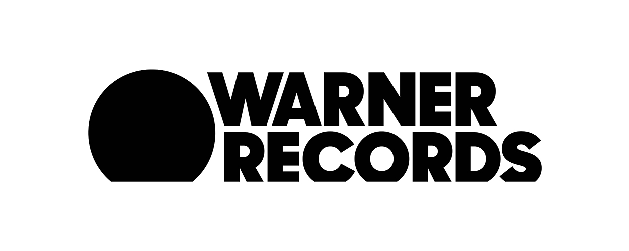
Warner Bros Records becomes Warner Records
By Chris Cooke | Published on Wednesday 29 May 2019
Take note everybody, Warner Bros Records has a bold new name. It’s ground-breaking. It’s game-changing. It’s awe-inspiring. It rewrites all the rules and puts the entire business of recorded music into a brand new light. Warner Bros Records no more! Welcome to the brave new world of Warner Records. Yeah, the brothers are gone. Gone and forgotten. Fuck the brothers! Especially Albert. What a cunt.
And with the new name, a new logo! Brace yourselves for this people, it’s going to fuck you up. Remember the Warner Bros shield? You know, the WB letters neatly placed inside a shield-like construct that popped up at the end of every Bugs Bunny cartoon you ever watched. Well fuck that. You know what a modern music company needs? What a proper 21st century record label requires? A black circle with a bit sliced off, that’s what. Is it a record? Is it the sun? Is it a globe? No, it’s a black circle with a bit sliced off. Good times.
The Warner Bros name and WB logo were a reminder, of course, that the Warner record company began as an offshoot of the Warner Bros film studio. But the Warner movie company and the Warner music company split off from each other back in 2004.
At that time, the former gave the latter permission to continue using the Warner Bros name and logo for fifteen years. Fans of maths will realise that that fifteen year period is now at an end, hence the revamp of Warner Bros Records. And, for that matter, the recent new visual identity for the Warner Chappell music publishing division, which never name-checked the brothers in its title but which did employ the famous WB shield in its logo.
Although it’s the expiration of a licensing deal that has necessitated the rebrand, the Warner Music Group reckons it’s the perfect time for a new look at its namesake frontline label, the US wing of which has a newish management team and a newish LA base. And that new logo, with its “artful simplicity and impactful typography”, is, we are told, “ideally suited to the digital world”. And as for the “circular icon, suggesting a record, a sun, and a globe”, it’s “a nod to the label’s past, present, and future”. Yep, new logo, same old branding bollocks.
“For the first time in the label’s history, we’ve had the opportunity to create a distinct, modern identity entirely of our own”, say Warner Records CEO Aaron Bay-Schuck and COO Tom Corson in perfect unison. “The timing couldn’t be better, since we all feel the label is at a moment of re-invention that builds on our legacy, while moving into a future driven by fearlessness and creativity. We have a growing roster of world-class artists, a rejuvenated team, and an incredible new location. It’s a new day for Warner Records, an iconic label that was born in the California sun, and is at home everywhere on earth”.
Talking of everywhere but California, there’s a UK version of Warner Bros Records, don’t forget. Or there was. Now there’s a UK version of Warner Records, with its own British black circle with a bit sliced off.
“We’re signing and developing the next generation of British artists to move global culture”, reckons the label’s UK boss Phil Christie. “So we wanted the Warner Records brand to have the power and freedom to mean different things to different people around the world. A new logo isn’t meaningful on its own, and our label will always be defined by the originality of our artists, our music, and our people”.
Lovely stuff. I’m feeling bad for calling Albert Warner a cunt now. He wasn’t a cunt. Jack was the cunt, we all know that.