
News just in from Planet Earth. The planet known as Earth no longer appears in the logo of Universal Music Publishing Group. Because the publishing division of the biggest music rights company in the world has dropped the world from its corporate branding, rejecting the 100 year long tradition of Universal branded entertainment companies having a sketch of the Earth in their logos.
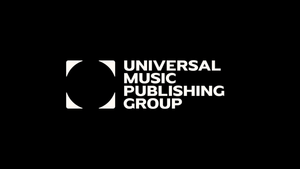
Instead, we’ve got a flat circle in a flat square. Though that circle could be an abstract representation of the Earth - a silhouette perhaps - if you’re willing to employ a little imagination and are very keen indeed to maintain that nod to a century old brand tradition.
Or maybe you just see four arrows? Or little people, angrily facing away from each other? Or, perhaps, four corners of a square? Or maybe four corners of a square peg trying to fit into a round hole? Or four spaceships blasting away from the Earth to take music beyond the boundaries of a shabby planet that constrains the ambitions of the most successful music company in the universe ever?
Officially speaking, though, we are apparently meant to see both corners and the world. Because whenever a big company unveils a new logo, it’s always accompanied by some exhausting brandspaffery, which normally comes across as nothing more than a way for the branding agency to justify its massive fees after delivering what is usually a pretty basic design.
In this case, the highfalutin nonsense comes courtesy of GrandArmy, an “award winning, multi-disciplinary creative agency” based in New York which makes a point of saying that it is “choosy with the clients we accept”. They’ve even produced a slightly painful video with an even bigger helping of waffle to launch UMPG’s new logo into the world.
Anyway, you’ll doubtless be on the edge of your seat with excitement when you hear that the new UMPG logo “represents the four corners of the planet - standing for a worldwide community of songwriters and reflecting how UMPG’s reach helps great songs travel across borders and cultures”.
It’s not quite the upside down elephant (“bowled over by the quality of the catalogue”) of the short-lived Hipgnosis glory days, but hey ho.
If you’re struggling to contain your excitement with that bold brand statement, brace yourself for what follows. “The circular space at the centre of the logo can also serve as a camera frame for songwriters, highlighting their talent and creativity at the heart of the cultural conversation”.
I mean it can’t, and it doesn't, but as circles go, it’s definitely a circle.
And it could equally represent the awkward silence at a brand meeting. Or a rifle site trained on human creators by a company that may soon be prioritising AI music. Or a big fat zero, representing the many many many zeros on overall Universal Music boss Lucian Grainge’s annual paycheque.
Or simply the giant empty feeling that will be familiar to anyone who has ever experienced the very particular hell of Uniport, Universal’s invoicing portal.
Unsurprisingly, no specific individual at Universal was willing to actually put their name to that helping of branding nonsense, though someone did manage to persuade UMPG CEO Jody Gerson to sign off on some slightly more generic - and therefore slightly less ridiculous - corporate gobbledegook.
“Our new brand is about celebrating the enduring power of songwriting and giving it a clear voice, a lasting home and a stronger future”, she says, which is nice.
“It’s an open, evolving identity dedicated to songs, songwriters and the people behind them; taking on new meaning wherever music goes”. Yeah, whatever Jody. Open! Dedicated! New meaning! No spaceships blasting off to explore the universe though, which is a little disappointing.
But enough about the logo, what about the new ‘purpose statement’ that the breathless branding twonks employed by Universal have come up with? Because, an official release notes, “in addition to the new logo and visuals, the identity includes a purpose statement”.
And what is that ‘purpose statement’? Well, “Universal Music Publishing Group exists to advance the collaborative, personal, human act of creating songs. We get songs heard. We get songwriters paid. Wherever songs go, we are a world ahead”.
Lovely stuff. I mean, technically Universal Music Publishing Group exists to make its shareholders a tidy profit, and to make sure that Lucian can continue to pull down the megabucks. But it’s nice to at least pretend that everyone is hoping all that other stuff happens along the way, at least some of the time.
It’s a shame the purpose statement couldn’t include a few extra lines, maybe “we always ask writers before opting their work into AI deals”, or “we ensure our sister labels don’t skew licensing deals in favour of recordings leaving hardly any money for the songwriters”.
Or maybe “we always make sure songwriters fairly share in the sale of Spotify equity profits”, or “we'd never go to the Supreme Court to try and fight a songwriter-friendly interpretation of US copyright law”.
But I guess that would make the ‘purpose statement’ a lot less snappy. Though, you never know, maybe that’s what the circle in a square is really trying to communicate.
Stare at it for long enough, and squint your eyes a little, and maybe that’s the message you’ll infer, UMPG committing to consent for AI, parity in digital deals, Spotify equity for writers and a global termination right. Now, that really would be standing up for the worldwide community of songwriters.
