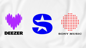
It must be new logo week, because Sony Music, Deezer and SiriusXM have all got new ones. Sony’s simple and understated logo seems to nod back to the iconic ‘It's A Sony!’ campaign from the 80s, while Deezer and Sirius are going for an overall... well, maybe it's better to let Deezer and SiriusXM explain exactly what they are doing in their own words. If 'words' is a term that adequately captures the high levels of first class brandspaffing nonsense that they've both come up with to explain why they've swapped their perfectly decent logos for new ones.
"Deezer”, warbles Deezer, “is reinventing itself as an experience services platform, with expression and connection as guiding principles to help artists, fans and partners to be and belong through music. To highlight the transformation and recharge people's emotional connection to the brand, Deezer is refreshing its visual identity".
We can all get behind that, I'm sure. But wait! There's more...
"The company now embraces a bold, fresh and quirky personality", it rambles on, "brought to life through a striking new visual profile and a unique purple heart logo. Matching the new direction, Deezer is also introducing an enhanced user experience and design in the app, to inspire and empower music fans to 'live the music' through personalised experiences".
Great. Lovely. I feel inspired. And empowered. So what does Sirius have to say?
"The new SiriusXM logo takes inspiration from the night sky," they patter, breathlessly explaining that they have put "a star at the centre of its iconic 'S' to represent Sirius, the 'Dog Star'. The star harkens back to the brand’s origins as well as gives a nod to the service’s consumer value proposition, bringing subscribers closer to the artists, hosts, celebrities, journalists, newsmakers and personalities they love. Interwoven into the new logo is this concept of 'closer', a refreshed brand platform that aligns with the heart and soul of the SiriusXM brand".
Everyone can definitely get behind subscribing to feel closer to the artists, hosts, celebrities, journalists, newsmakers and personalities that we all love. And it's nice to see all that lovely subscriber money being sensibly invested in self-referential nonsense like this.
"SiriusXM’s updated logo and branding come with a new colour system, born of the company’s name and star, Sirius, the brightest in Earth’s night sky”, it goes on, somewhat repetitively. “The blue, black and white logo colours reflect those that can be seen when observing the Sirius constellation from Earth. The brand’s secondary colour palette, the firepower colours, reflects how stars vary in colour and heat during their life cycle".
Like anyone cares.
The re-brand comes ahead of the launch of a new SiriusXM app next month which will more closely align the company's radio, music and podcast offerings, it having discontinued its standalone podcast app Stitcher earlier this year.
Sony Music hasn’t issued any statement on its new logo, which - going by the nonsense above - is probably a good thing.

